Thursday, December 22, 2011

Inspiration


I can't draw anything like the first two, but I might try to draw up some sketches to scan in.

The last one is a similar idea to my last few ideas, with the cityscapes and city themes on my hands.

Wednesday, December 7, 2011

Another photography idea

I wanted to have two contrasting places put together. An image I found of a drawing of a city on a hand gave me an idea.
I began to sketch an idea into my book which I could later paint onto my hand and take photographs outside among the trees, flowers, ect.

Unfortunately, as soon as I got outside, it started to rain! So I could not get many good shots.
My painting then began to run, it was cold and it had gotten dark.


EDITED

<- Edit 1.

Thursday, November 24, 2011

Paramore


I found this interesting because the text on this image is the title/some lyrics from Paramores song; 'The Only Exception'. They are an artist I am very likely to have on the final CD.


Soon after seeing the first image, i saw this one. I thought I could put the lyrics to some songs behind a cityscape, or just somewhere on the image I photograph.

More edits!


*NOT MY PHOTOGRAPH*
Found on 'www.weheartit.com'.


I was looking for more photography ideas, and I found this picture. I really liked it, so I wanted to photoshop it to look abit weird. I love the 3D effect on it. It is something I'd really like to put on the final piece.

Thursday, November 17, 2011

Inspiration for photography


I have chosen this picture because I think it is something I could recreate, or create something similar due to the surroundings of where I live being mostly trees.

I can edit these particular effects onto it on photoshop, and brighten the colours to make it look more tropical like it does on here.

The only thing I don't like is the bins at the bottom. You need to look at the picture properly to see them, but it makes the picture look a littleless professionally-taken, and without them I think it would look like it was taken in a rainforest.


I like this picture because it is something I can do again. Although it is completely different to the first pictures I took, I think with the right look on the girls it could look good. I can easily add the 3D effect on photoshop.

The problem would be getting a picture that I really like.


Again, I like this one because the surrounding are similar to around my house (especially the bare trees, as it is now winter when I am editing this post.) and it looks very simple and beautiful.

I'm not sure how I could add these effects, I would need to research it online but it is something I have wanted to learn to do for a while because they can make a photograph look abit magical.


I like this one because it is taken on a beautiful, almost cloudless day and it is very simple,but effective.

If I were to recreate this, I would look at the work of Mike Farrell (Graphic Designer for Fearless Records and his typography, some music-related quotes.


This would be alot more complicated to recreate as it is an amazing piece of art and a very intricate drawing.
It would take a long time and I would need a good idea for what to draw. I may draw one as a draft to get feedback on.

Wednesday, November 9, 2011

Edit Feedback!

Feedback

I think this feedback is very useful because it has some improvements I can make. (Colours round each band member/ more suitable text.) The text was a little rushed, and I should have looked for a new font. I will also need to figure out how to give each of them an individual colour. I plan to make these improvements next week.
Also, fans of the band have said it is very good which is what I wanted to happen. It shows I did a good job on the edit and got the right kind of style for the band.

Thursday, October 6, 2011

Photoshop Editting!

I decided to do some edits for the 2nd side of the CD. I chose some pop artists and tried to make an album cover from them.

I liked the first edit alot. This is One Direction that have been very successful after Xfactor.
I think this is a picture snapped of them when they were simply walking down the street. They probably weren't expecting it. If they were having a picture taken for an album cover, they would probably go to a proper photoshoot, but I still thought this was a good photo to use.
Firstly, I wanted to put the focus on the band. I lasso'd the band and changed the hue to a green colour. I then outlined the band with orange, because I think it clashes with green and should make the stand out. I then decided I wanted it to look like their picture had been cut out and stuck on there. I did this by adding a shadow.
Another way I made them stand out was to blur and change the background. I used a 'wind' effect after blurring. This also effect the image of the band, but I didn't change it because I thought it looked good.


Saturday, October 1, 2011

Photography

Today I was thinking about ideas for the album covers. It was a nice day, so I thought I'd go out and get started on the alternative side of the CD.
I saw my brothers guitar and thought about going out to take pictures of that in places in the area I live. To make this more interesting, I painted onto the guitar. When I was painting the design onto the guitar, I wanted it to be colourful and simple, but have a 'happy' feel to it. At first I painted round my hands and added patterns into the middle of them. I then thought that it was too busy and I didn't like the patterns. I got a cloth and washed it off. When trying again, I decided that just painting the hand shapes one colour would be enough. The dots/splats around it were added because I thought that part of the guitar looked empty but I didn't want to add swirls or flowers.
Here is a picture of what it looked like at the end;
I will probably do a few different designs on it because I like this idea alot. I may take this guitar to lots of different places and try to find a really interesting place for it.


I have tried out editing afew of the pictures I took of the guitar. These are my favorites so far;


I like this one because you get a good look at the patterns I painted on this guitar. I also like it because it's colourful but simple. It's simple because it doesn't have a complicated background or too much going on, it's just a guitar with hands painted on.
One thing I wish wasn't on there was the spot of light at the bottom. It doesn't ruin the photo and probably wouldn't make it tonnes better, but I still wish it wasn't there.


I like this one alot, mainly because it's at an unusual angle.
I edited the lighting and it's made the guital look a nicer colour than it actually is. I think it gives it a nice early autumn feel, where the first picture gives a summer-y feel. From research I've done, alot of compilation CDs often feature the season they have been released in. Although this wasn't my intention when taking the pictures, I'm glad I thought of the idea of putting some fallen leaves over the guitar.
You can't see the pattern very well because of the leaves covering the bottom of the guitar, but I like how it's covered the main part of the pattern and only showing the spots at the top. The photo might have looked too busy with the pattern, leaves, grass and neck of the guitar all in it.


k


Tuesday, September 27, 2011

Graphic Designer Answers!

When I was looking for email addresses of record companies so I could ask them questions, I came across one record company that had seperate email addresses for different jobs within the company. I looked at these titles looking for someone I could separately email about album art, and I found one. This is the email I sent;


Hello, I'm doing a Creative and Media Diploma Level 2 at school, and I'm doing a higher project about the difference in album art across different genres. If you're not too busy, I'd greatly appreciate it if you could answer a few questions that which would really help me out.

I saw on the Fearless Records website that you are in charge of graphic design. Does this mean you are in charge of the design of album covers? If yes, could you please explain the process you go through?

Thank you so much for your time!

Courtney Hackney
Brigshaw High School

And this is the email I received a day later!

Hey Courtney,

I am in charge of all online graphics, Magazine ads, Tents and tour graphics, album art, etc. Basically anything that has a fearless logo on it passes my desk at some point.

Album art is a difficult process because it involves so many different people.

First the band has to come up with a name for the record.
We develop a concept for the art together.
We agree on a look for the artwork.
I hire several designers to work on cover art concepts.
The band and fearless management discuss the concepts sent by designers
We come to an agreement on the correct mockup to go with.
We hire a certain designer to finish the cover.
Once we have a finished cover, we start developing the rest of the packaging. (usually I propose something like a digipack, jewelcase w/ certain number of pages in the booklet, etc.)
Either I or the designer that created the cover will finish the rest of the layout.
I send everything off to proofing for press checks.
I make sure everything is cool with the colors, pick spot colors for the disc art that match the offset print
Tell the printer how many to make.
coordinate shipping of all the product.

Thats really about it. Let me know if you have anymore questions!

Thanks,


MIKE FARRELL
fearless records

I think this is a really interesting reply. Him and his team can do everything to do with the designing of the CD, from the type of CD case to the design of the booklet inside.
I would like to look at some of his designs and see if they have some similarities or if they are all very different.

From this I have found out that if I were to go into graphic designing, I would need to be skilled in lots of things. Not even just designing, I would need to be able to communicate with bands and try and figure out what designs would suit the bands and their attitude, and decide how many to print and sell. He also mentions he designs online graphics, tour graphics and magazine advertisements! He is obviously a very skilled guy to do all these jobs. It all sound so interesting and it would be an amazing job to have.
Luckily, I only need to do half the jobs that Mike would need to do, and I'm not creating it for a big company so I have alot less stress.

Thursday, September 15, 2011

Record Labels

I'm going to try to contact some record labels by email and ask them if they have a process for creating a successful album cover.

Here are the questions I am going to ask;

Does the record label have any choice in deciding album covers for artists/bands?
If yes;
- Do you have a specific team for it?
- Do the artist/band sit down with the team and decide?
- Are several covers drawn up/made then decided on?
- Do different people do different jobs, e.g Title name, cover colours, back design, lyric book design(if there is one)?


I'm going to try to contact these labels first (pop/rock genre)

Rise ,
Ferret,
Warner Music,
Fearless,
Tra
gic Hero,
Columbia,
Equal Vision,
Visible Noise,
Epitaph Records,
Thirty Days of Night,
Earache Records,
Shock Records

Thursday, September 8, 2011

CD Case Materials; Advantages and Disadvantages.

A jewel CD case is the original case that has been used to hold CDs since 1982. There is normally a disk-shaped tray which the CD fits into so it doesn't slide around in the case, which would scratch and damage it. There is also the 'jewel' in the center of this, it's like a circle of teeth that holds the CD in, again so it doesn't move around and scratch. But you probably knew all this.
The circular tray and the jewel are two advantages of jewel cases, because it prevents damage to disks. Also, the plastic the case is made of is sturdy enough for everyday use and shouldn't case much damage if it's dropped, however I find that double disk cases are very fragile, and many double disk cases of mine have fallen apart, and I would need a double disk case for my final product.


The simplest and least expensive packaging would probably be a paper sleeve! The advantage of them is that they're very cheap.
There are more disadvantages though, because the disk can get damaged very easily as paper isn't very good protection. It will keep the CD clean, but won't keep scratches away. Another disadvantage, or would be to me for my project, is that it would be very difficult to get any album art on it, and to have two disks in it. I could stick two sleeves back to back, and then decorate the front, but I don't think it would look very good or proffesional. If I thought about it in a professional way, it wouldn't be very easy to mass produce (not that I will be doing that) so that is another disadvantage.


This is one I had never thought of until I had researched different possibilies for the case. I recognise them as cases normally used for work videos/tutorials or the ones you get in newspapers. My dad has brought home afew like these.
They have a cardboard cover, which is more protective than paper but not as good as plastic. The cardboard cover would probably be very easy to design, for one genre anyway.
They then have a plastic part where the CD is held. This is good, because it's one of the main reasons I prefer the jewel cases.
There are afew problems though. I don't know if there are these types of cases which can hold two disks in the same case. The two CDs wouldn't get scratched because I would put the 'music playing' side down, and the two tops may get a little scratched. I also don't know how easy it would be to get hold of afew of these to do drafts of. In addition to this, I kind of need the case to be symetrical, so it gives the two genres in one CD case a good effect.


A diskbox slider case is similar to the digipak above, except it doesn't seem to have the plastic holder in it. I think my Pegasus Bridge cardboard case is like this, and I think it's really nice because it's different. However, I have the same problen with the double disk thing, putting them in the same case would probably scratch them if put in the wrong way.


Information found on;

- http://en.wikipedia.org/wiki/Optical_disc_packaging
- http://www.ehow.com/list_6685308_types-cd-cases.html
- http://ezinearticles.com/?CD-Cases&id=221854

Monday, September 5, 2011

Alternative Compilation Albums


Snow Patrol - Up To Now

This album features the highlights in Snow Patrols 15 years+ career. It's a compilation album because it contains music from different years, and music 10 years ago is different to music now.
I like the simple design. The snowflake relating the the band name 'Snow patrol'. The font is simple too, and I'm seeing the red title on a lot of albums in this genre and I think that's something I should use on mine.
 I really love this cover!
This is like Snow Patrols album above, but it also contains live recordings, out-takes and rarities as well as songs. It's a part of anthology trilogy released by Apple Records.
I think the front represents a kind of journey, because it looks like ripped up posters from different shows or tours. It's a really interesting cover.
I wouldn't buy it, because I'm not really a beatles fan, but I think i'd like to create a cover like that for my final product. It's eye-catching and interesting. I'm just worried I'm not creative enough to do something like that!

Kerrang! is a pretty well-known rock music magazine.
There is also a Kerrang! Music channel, where songs from 'nu metal' and 'pop-punk/skate-punk' are played. Songs can be requested via text.
Kerrang is like the rock version of the Now! CDs.

Aswell as having multiple artists on the CD, it is has two CDs in the album. It also looks like it's an annual CD but I don't think the artists on the CD will change very much.
I don't really like this cover, I think it's quite boring. The font is the one that Kerrang use on their magazines too.

Sunday, September 4, 2011

Pop Compilation Albums


These Pop Party CDs have been around since I was in primary school, I loved them!
They're like the Now! CDs except they have a younger audience, but the have a lot of the same music.
I think they're for a younger audience because I listened to them when I was younger, and they're very colourful and have younger kids 'idols' on the front like Miley Cyrus, Justin Beiber and JLS.
I think I will use alot of colour on the pop genre side. But I don't want the target audience to be the same as this album.

This is a random compilation CD I found. I haven't seen it or heard of it before.
It's just the type of CD you can put on when you're sunbathing, or driving to the coast. Or that's what it looks like to me anyway.
The picture on the front makes you wish you were on holiday!
I don't think I will be taking any ideas from this for my final piece. It's nice for the 'Summer Hits' but I don't think it would suit what I'm wanting on mine.

These are probably the most well-known compilation CDs. I've written a little bit of information about them before, they're released several times a year, and feature the top 40 in the charts at that moment. They have 2 CDs in them. The number '79' on this one means it is the 79th to be released.
I like the cover of this because it's colourful and the season it was released in is clear by the flip-flops on the front. This was most likely released in the summer.
I like how the title is huge and it's colourful. I will definately put that into my album cover.

A Little Information About Compilation Albums!

The simplest way to explain what a compilation CD is would be to give the example of the 'Now! That's What I Call Music' CD's.
They are albums with multiple artists on the CD. Sometimes there are multi-genres, sometimes there are multiple disks in the case.
There can also be single artist compilations such as 'Greatest Hits' albums. These count as compilations because the music can be from different years, instead of normal albums where they are recorded for a specific album over a period of a few month, or have several CDs.

Why is this relevant to my other writing on album covers?
Well, my projects final piece will hopefully be a compilation CD, an album with 2 CDs of different genres, featuring different artists.
This may also effect the cover of my album. I need to think about how to make my album cover the same kind of style. I think I need to look at compilation album covers for each of the different genres of music in the album.
That will be my next thing to research!

Information found on;

- http://en.wikipedia.org/wiki/Compilation_album

Friday, September 2, 2011

Double Sided CD's?

I don't think it will be possible for me to do a double sided CD like I expected. When I look at my CDs, I find that there isn't really a way I can burn music onto either side. This is possible with some DVDs, but not CDs.
There was some research into 'Dual Disks' but they arn't very easy to get hold of yet, and I don't even think they're used yet.


I've been thinking of a solution, and I think instead of a 'double sided CD', I'll just do two different CDs with two different genres. This  means I will need to find a CD case with two CD compartments in it, it shouldn't be too hard.
I may try to do designs on the front of the CDs, but I don't know how possible that would be either!

Tuesday, August 30, 2011

Particular band album covers; Muse.

"Muse are an English alternative rock band from Devon, formed in 1994. The band consists of school friends Matthew Bellamy (lead vocals, guitars, piano, keyboards, keytar), Christopher Wolstenholme (bass, backing vocals, keyboards, guitars, harmonica) and Dominic Howard (drums, percussion, synthesisers, sampling, harmtar). After the release of their 2006 album Black Holes and Revelations, keyboardist and percussionist Morgan Nicholls has performed live with the band. Muse are known for their energetic and extravagant live performances (often being claimed as 'the best live band in the world') and their fusion of many music genres, including space rock, progressive rock, alternative rock, heavy metal, classical music and electronica." 
- Wikipedia info - http://en.wikipedia.org/wiki/Muse_(band)

Muse, to me, are a very weird but amazing band. They are very random with their music genres. Many albums contain different kinds of music on one, but their music also changes from year to year. The lyrics to their songs are also very strange, and complex. They're more like very very good poems. They're written by Matt Bellamy.
Another weird thing about Muse is the covers. They're all very random. Being a pretty long running band, there is also plenty of them so I thought this would be an excellent band to look at.
Muse also means something to think on, something inspirational, and something around progressing particularly in science or art. Thinking about this in terms of album art, I think it's visable. They're definately something to think about, they're definately inspiring, and very art-y.
Examples; 


        So as you can see, they're all a little strange. I think they're amazing though at the same time.
I don't really think there's any rational reason to many of them, but I can guess what I think.

Showbiz; The girl on the front in the white dress looks kind of like she could be a movie star, or in some kind of  'showbiz' career. I'm not too sure why she (or it looks like) is on the moon. I think that's just Muse being Muse.

Absolution; Absolution means to be freed of guilt, sins, or greed. Mainly in a kind of religious way. The religious part could explain why the shadows on the ground have their arms out, maybe like jesus on the cross. Maybe the man looking up into the sky is looking to God. Maybe.   

Resistance; It doesn't really make much sense at all. All I can think is 'The Uprising of the teddy bears.'. This is a newer album, maybe they were just trying to attract the attention of new fans. Either way, I can't tell if it has been photoshopped or if they actually did plant teddy bears into the ground.

Monday, August 29, 2011

My Top 5 Album Covers (of the CDs I own) in my opinion

I thought posting my opinions on the top 5 albums covers (that I own) would be a good idea, so here it goes :)
I'm going to try my best to purely base it on the album cover, and not the music!


I think this is my favorite because it's very colourful, but it's still simple. The cover is related to the album title, so it's not completely random or pointless. The bands name is in decent sized lettering on the front so I can recognise it if I want to listen to that band. The lettering is also the font that the band typically use, keeping a kind of consistancy in the album covers.

On the back there is the tracklist, and on the inside the image on the front is also a small booklet with lyrics to the songs inside it, as in many CD's now.


I think this album cover is a very pretty but simple cover. The explaination behind the butterfly on the cover is some lyrics in a some called 'Brick By Boring Brick'; 'Now she's ripping wings off of butterflies'. Brick By Boring Brick is one of Paramore's more known and loved songs.
The bright yellow on a neutral grey background makes it stand out, and it's a very recognizable cover to Paramore fans. This is common with another of their CDs, Riot. Another CD with a simple yet affective cover. However, I don't think that's the case with the 'All We Know' cover, which isn't as simple. But it's also an older CD.
The font in the top right hand corner is a simple font. The word 'Paramore' is written in a font that is used on a lot of Paramore's CD's. 


I think this album cover is very warming and friendly. It's very simple again, with just a simple image in the middle. I think it looks like a man and a woman holding hands, it could just be two people, but it looks like a man and a woman to me.
The Script often sing about break-ups, and the majority of their songs arn't happy songs. This one in particular has been said to be sadder than others, which could explain the picture on the front some more, like they're offering support or something. I think it's a very nice cover anyway.
The title 'Science and Faith' is a popular song on the CD also.   


This CD cover is actually made of card or paper, not plastic like the others. They might have done this because they're not a huge band and it was cheaper, or they might have liked it to be a little different.

The picture on the front isn't as simple as the others, or at least not in the same way. It's a photograph with a young boy, possibly relating to the album title 'While We're Young' (It's a song on the CD). I don't really know why it's a young boy that looks like he's running away from home, or travelling somewhere on his own though. I really like the photograph and the colours of it though!


This is the other Paramore CD i was talking about in the 2nd picture.
The cover is abit busier, but it's still simple in a way because of the simple red sofa being the focus.
The font for the band name is the same as the other CD, and there's some smaller italic writing for the album name, also similar to the other CD.
This CD isn't as popular. I don't find it as appealing as the others really. I bought it because it had alot of songs I liked, then others I'd never heard before.

Thursday, August 25, 2011

'Best' album covers of all time?

According to the Rolling Stones writers, the top 10 greatest album covers are;
                                           

This is 'Sgt. Peppers Lonely Hearts Club Band' by The Beatles. Sgt. Pepper was a ficticious persona that McCartney wanted to create, one for everyone in the band.
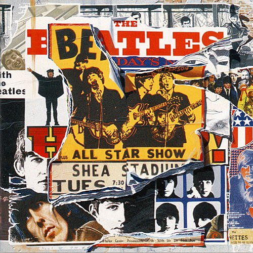
It's a very colourful and attention grabbing cover, and there's lots of places to look. I think The Beatles are on this at the left hand side, in their suits. The band dressed in their suits would be what album covers typically were at this time, and I think it's cool that they have that on it and a people in fancy dress and loads of colour. It's a very jolly album cover.


I think the language on this album by the Sex Pistols might not have been expected at this time (1977). I'm not sure, but I don't think it would have been something to be written on an album cover.
It's a simple cover that looks more like a poster, it's in a bright yellow to attract the costumers eye.
I think it might attract either curious people or fans of the Sex Pistols because I don't think it's an album someone would buy because a friend suggested it.

  
No. 3 is another album by The Beatles. It's called 'The White Album', this is because it's white, obviously. There is a picture, it's just not visible. If you look closely, 'The Beatles' is written in the center in a small font. I think people might have seen it and thought it was printed wrong or something, making them look further into in and maybe interesting them into buying it.
I like the simplicity of it. This was released a year after the album at number 1. It's strange how they went from such a busy album cover to an almost completely blank one.


This is 'Sticky Fingers' by The Rolling Stones. I think it gives off a good 'rock' image, with the contrasting on the image and then the red stamp kind of font over it. It's pretty simple, and I think most rock CDs have maybe been inspired by this. An album by 'The Pretty Reckless' looks pretty similar to this, with the same kind of contrasting on the picture.
Again, it's simple. There artist isn't featured on it (they could be I guess) and the title and artists name are on the front in a red font that sticks out against the picture.


I don't understand this album cover much. I think it's just really random. It's another by The Rolling Stones and is called Born In Exile. I think it's just a load of photos that the band found interesting put together onto an album. It looks good, and still has a kind of rock image, but it's more interesting than the other because it's a busier cover and there's alot more to look at, like individual pictures.
The album name is scrawled at the top in red writing again, it's not in a very neat font.
Exile means to be banished or to be away from their home, so the title sort of means to be 'born away from your home'. I think this is to add to how abstract the album cover is.


Information found on;

- http://rateyourmusic.com/list/fedderedder/rolling_stones_100_greatest_album_covers

Friday, August 19, 2011

Different genre, different design.

It's pretty obvious different music genres have different album cover designs. This is because they attract different audiences, and need to appeal to different 'types' of people.


Pop;   This is a popular music CD. I've already analysed it in my second blog post, but i'll do it again. It has bright colours, and the popular name/brand of the CD in big letters on the front, making it stand out again other CD's in shops, also making it easy for someone to find. They're released 3 or 4 times a year, each time featuring the popular music at that time.


Pop/ Rock; CD covers like these normally have an artistic picture on the front, often related to the lyrics of a popular song on the CD. They also have a certain text for the band/artist, like the 'Paramore' on the front of this one, this text/font is used on most of their album covers. I think it gives all the albums a kind of connection, making them all similar in a way.


Rock;

Thursday, August 18, 2011

Good and Bad Album Covers?

Today i'm going to research what makes an good album cover, and what makes a bad album cover in my opinion.
I say in my opinion because I think some people might prefer certain things for different reasons. They might like a big title so they know which CD it is if they have bad eye sight, and someone else might think it looks better simple and without a huge title.

When I think of an album cover that would catch my eye, I think of a bright album cover with an interesting or funny picture on the front which clearly has the band/artists name on the front. I love colour because I think it makes a CD stand out from others, and colour just makes it look pretty in my opinion. When i'm looking for a CD, it helps if the title or artist name stands out because I have bad eye sight so if I'm look for a particular one, I can save a lot of time looking. They probably don't mean to have big titles on it for that though, the artist probably just thinks it looks good themselves.

When I think of what i'd consider a bad album cover, I think of one that just looks cheesy. Like a Highschool Musical cover. I don't mind album covers with the artist on them, but covers with some kind of art or photograph appeal to me much more.

Sunday, August 14, 2011

'Album art brings together two artists, the designer and the musician.'

Album art will have been around for ages, but i'd like to find out when it actually started to make an impact on albums and when people actually put some thought into it rather than just putting a photograph with a CD and calling it an album.
So I've been searching the internet to find abit of background on album artwork. Here's what I've found, put into a few paragraphs in my own words :)

Sources say it was first introduced (not 'created') in the 1940's. They started off as drawn illustrations and then in the 50's moved on to being photographs. The photographs normally showed a 'typical' life. For a start, everyone was white, were in suits or cocktail dresses and usually featured 'perfect' children.
One guy called Sgt. Pepper (The Beatles. An alternative persona of the band members) decided to change it into something more creative, like the music itself and started to bring together two artists, the musician and the designer. He started to forget head-shots, portraits, and band photos, and focused (or not focused) on things that weren't reality based. 'Sgt. Pepper' came up with a sheet of paper cut out dolls and cut out moustache. He printed lyrics on the back.
After 'Sgt. Peppers' ideas, it became a kind of competition as to who could get the best-selling album art. T
he Rolling Stones even produced an album with a 3-D cover dressed as wizards in an effort to 'beat' The Beatles Album art even insprired fashions in the 60's. People were more adventurous about what they wore. Creative such as David Bowie followed the trend, another thing which influenced crazy fashions.

At the beginning of the 90's when CD's replaced vinyl as the main music player,
Even 20 years later, vinyls still arn't considered out-dated in a way. People use them in lots of different ways. This generation still think they're cool looking. I've even seen bags made out of old records in a shop. They're still considered creative and unique. Not many people know the roots of album art, but as I've researched this, I've found it really interesting and I'm glad I took the time to read up about it.


Information from; 


- http://en.wikipedia.org/wiki/Sgt._Pepper's_Lonely_Hearts_Club_Band
- http://en.wikipedia.org/wiki/Cover_art
-http://en.wikipedia.org/wiki/Album_cover

Tuesday, August 9, 2011

Analysing CD's

I've decided to write a little bit about why I think the album cover was chosen/designed, how it attracts a certain audience and how effective I think it is.


My CD's

YOU ME AT SIX - HOLD ME DOWN.


This is one of my favorite albums. Being my favorite band, there were afew CD's to choose from since I hadn't got any of the CD's from them at that time. The album art did attract me to this one because the colours were bright, and the front is very pretty.
After listening to the CD, I thought the cover might have a link to one of the songs on the album, Fireworks. It isn't a firework exactly, but it looks kind of like a colourful explosion, like a firework.
It doesn't feature the artist/band on the front.
I think it will attract an audience who is familiar to the band, because of the band name being very clear on the front. The colour could attract an audience who is just browsing through CD's and may make them choose this over a duller CD if they could only choose one CD.

A DAY TO REMEMBER - HOMESICK

I like the art on the album, it looks creepy but cool. I think it's strange how the actual band name and title arn't on the front though, although they are on the side of the CD case. I think that it's made to look creepy because the album name is 'Homesick' (The title of a song on the CD) and when you're homesick, you could be in a strange and unfamiliar place you haven't been to before. Maybe the light at the end is their home. Again, it doesn't feature the artist but it does have the a person/figure on it.
I think the picture is supposed to make the audience look closer at the CD because the band name isn't on the very front. When it's in your hand, you might flip onto the back to see what songs are one it if you recognise the band, and see if there's some you know. I would anyway.


PEGASUS BRIDGE -WHILE WE'RE YOUNG

 This band creates (or created. They split up last month) a different kind of music to the others. The songs are much softer, except maybe one titles 'Ribena' which is more pop-y, one of the more well-know and well-loved ones.
The album cover features a young boy, which relates to the title 'While we're young' (Which is also a song on the album.). I think the photograph is beautiful. It also has a faded look to it, which could make it look like it was taken when they WERE young. But obviously it was taken for the album cover, over used as the album cover. It probably isn't anyone from the band.

My brothers CD's
NOW! THAT'S WHAT  I CALL MUSIC!

The 'Now, That's What I Call Music' CD's feature popular music (usually from the top 40 charts) at that moment in time. There are 3 released each year. One around easter time, one near summer time, and one in November. This one was clearly released in the summer, because it has seashells on the front, like a beach. It's not a new one, it was the first one I could find. It doesn't have artist on the front because it has various artists on the CD.


The 'Now!' CD's are a well-known CD, so big title on the front will mean it's easy to find in big media shops like HMV.


FLOORFILLERS 2010

This is a remix CD. I think it was one my brother just randomly picked up or one he got for christmas from our cousin. It's colourful and puts across the image of a club. The '2010' on the CD makes me think that they are released annually (every year) with the new 'biggest dance hits of the year'. On the front it names big names that will be on the CD to catch eyes of fans. It has 2 CDs which is clearly marked as another selling point.
I think the audience is clearly people who like popular and 'now' dance music.